
Retail Store Design: The Customer Journey Is The Strategy

For decades the physical store competed for the transaction. It was where you bought things, and design existed to fit as much product as possible into as little space as possible.
That job is no longer exclusive. The transaction can happen on a phone at any hour. What the store still does better than any other channel is let a person touch, compare, ask and decide in one place. Commercial design stopped organizing product and started organizing decisions.
The Four Moments Of The Journey
Any store, whether a pharmacy, a supermarket or a boutique, can be read as four moments. Designing without separating them is the most common reason a floor plan does not work.
Arrival. The first few metres. The customer is still leaving the previous context, the mall corridor or the street. Attention is low and pace is high.
Orientation. The customer is working out the logic of the place. Where the thing they came for lives, how it is organised, which way to walk.
Discovery. Now oriented, they allow themselves to look. This is where unplanned sales happen, and it depends almost entirely on height, lighting and how far the product sits from the path.
Decision. Fitting room, counter, till. It carries the most friction and usually gets the least design attention.
The Decompression Zone: The First Five Metres
Retail practice calls the area just inside the entrance the decompression zone, the stretch where a customer is not really looking yet. It is a well documented effect with one direct consequence: whatever you put there is barely seen.
The classic mistake is filling that zone with the store's best display, with promotional stock, or with a counter that forces an interaction before the customer has decided anything. The result is that your strongest merchandise sits exactly where nobody registers it.
The first metres of a store are not for selling. They are for letting the customer change speed.
What does work there: open floor, a clear sightline to the back of the unit, and a first orientation cue. A customer decides within seconds whether a place is legible, and that decision shapes the rest of the visit.
Sensory Design: Four Decisions Customers Feel Without Noticing

Light
Contrast matters more than quantity. A uniformly lit store reads flat and tires people. A moderate general level with accents on the product you want seen guides the eye without the customer knowing they are being guided. In categories where product colour decides the sale, textiles, fresh food, cosmetics, colour temperature and colour rendering are a commercial decision, not a technical one.
Acoustics
A unit with hard surfaces and an exposed ceiling builds reverberation. The customer does not say there is an echo, they say the store is uncomfortable, and they stay for less time. A little absorption overhead usually solves more than it costs.
Material and touch
The surface a customer rests a product on to look at it communicates price. A solid timber table and a melamine one hold the same item and position it differently.
Route and rhythm
Alternating high and low density prevents visual fatigue. A store with the same display density from front to back gets walked quickly and without stopping.
Formats In Panama: Mall, Street And Neighbourhood
The three formats that dominate the local market call for different decisions, and are frequently designed the same way.
In a mall, the fight for attention happens at the facade and in the first two metres. The customer is walking past with a different objective and has to be interrupted. The window and the sightline from the corridor are the main assets.
On the street, the customer usually arrives with intent. The facade works less and the interior more, but sun protection and the thermal transition become critical in this climate.
In the neighbourhood format, small units with frequent visits, speed rules. Orientation has to be immediate, and the till area cannot produce a queue visible from the door.
Fixtures Have To Be Able To Move
A store that cannot be reorganised ages in a single season. It pays to decide at design stage which elements are fixed and which are mobile, to work in repeated module widths rather than one off pieces per position, and to plan power outlets so displays can be relocated without construction.
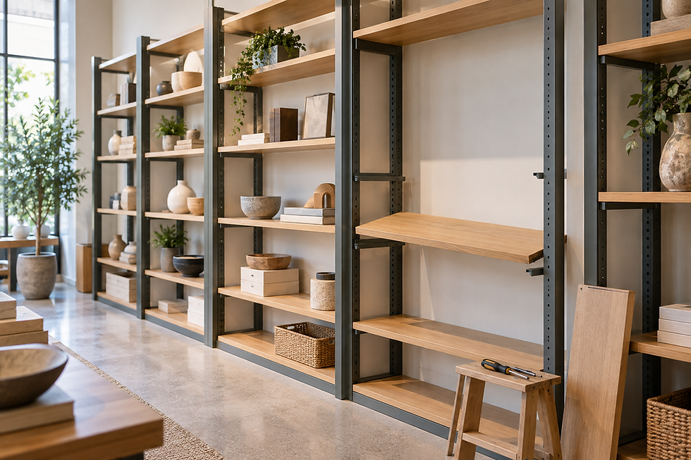
When fixtures are custom made, that flexibility is solved in the design rather than in the budget. It is the difference between a refit every three years and a seasonal adjustment.
Five Expensive Mistakes
Putting the best display in the decompression zone.
Designing the till at the end of the project, when there is no room left for the queue.
Display above eye level, which in practice is decorated storage.
Fitting rooms treated as a requirement rather than the highest converting point in the store.
Uniform lighting, chosen out of fear that something will be left dark.
What To Measure After The Refit
Three numbers tell you most of it. Conversion rate, meaning how many of the people who walk in buy. Dwell time. And units per transaction, which is where you see whether discovery is working. Measuring them before the work starts matters as much as measuring them after.
Planning a new store or the refit of an existing unit? Request a consultation.
Comments